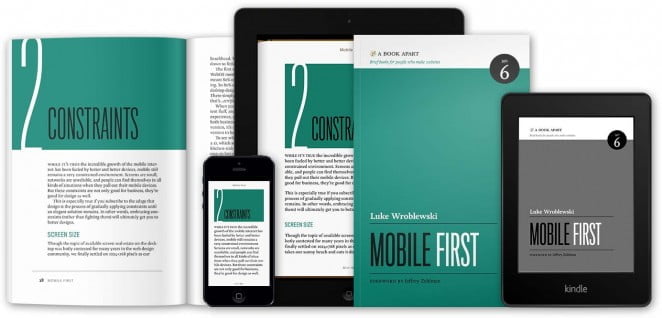
Although you won’t find any code in the book Mobile First, it is still a good read even for developers.
You will find a business case for mobile first and many design patterns and best practices that you can continue coming back to as you design and develop mobile web experiences.
One exception is the mention of the viewport tag, which is very useful for designing mobile web experiences:
<meta name="viewport" content="width=device-width">
To quote Peter-Paul Koch, who has written about view-ports and mobile development extensively:
Normally the layout viewport takes a width that the vendor has decided is optimal for viewing desktop sites. By setting the meta viewport to device-width you’re sure that your site’s width is optimised for the device it’s being viewed on.
A BOOK APART releases brief books for people who make websites. Issue #6 written by Luke Wroblewski is about the a new paradigm in web development: Mobile First. Although there are various constraints on small screens, the author encourages to rather see them as opportunities to focus on what’s really important. Moreover there are also things you can do on mobile that you cannot do on the desktop. So one can use mobile capabilities to innovate the complete customer experience.
The book concludes by encouraging not to be afraid to start small.
Some of the biggest successes in mobile today came from small experiments and teams of passionate web designers and developers. You don’t need to know everything about mobile – just take what you do know and go.
Although on this blog and website we «only» have 10% mobile visitors, we’ve used the WPtouch Pro already 2 years ago when there were only 5% mobile visitors. This plugin for WordPress is an easy one-click-install with some minor configuration (although it has lots of customization settings). We then decided to develop our own responsive theme in March 2013 in order to make our mobile website look more individual. It currently only has one break point for smart phones, but we’re already planning a second release that adds another breakpoint for tablets and optimizes navigation.
Some of our e-commerce customers already have 20-30% mobile visitors, so it’s about time for them to provide a true mobile experience for those visitors. Magento Community Edition comes with a mobile theme that can be easily customized. The latest WordPress default theme Twentythirteen is responsive and Shopware 4 is also on its way to responsiveness out-of-the-box.
Those still using osCommerce now have another good reason to finally migrate to state of the art open source e-commerce software like WordPress, Shopware or Magento.


Schreibe einen Kommentar